TL;DR:
- User-friendly crypto analysis tools turn complex market data into simple, actionable insights accessible to all investors.
- They feature pre-configured dashboards, clear workflows, and focused indicators, reducing learning curves and decision fatigue.
- Effective analysis relies on a small set of well-chosen signals, emphasizing understanding and structured decision-making over overload and automation.
Most investors assume that reading crypto charts and running technical analysis requires years of experience, advanced math skills, or a finance degree. That assumption stops a lot of people before they even begin. The reality is that a new generation of user-friendly analysis tools has completely changed the picture, turning market data into visual, actionable insights that any investor can use. In this guide, we walk through what user-friendly crypto analysis actually means, which features matter most, and how to apply these tools to make smarter, more confident investment decisions.
Table of Contents
- Why crypto analysis feels intimidating (and how user-friendly solutions help)
- Core features of user-friendly crypto analysis platforms
- Making sense of signals: Why less is more for actionable insight
- User-friendly does not equal fully automated: Navigating uncertainty
- How to choose and apply user-friendly analysis tools for your crypto portfolio
- Why most investors overcomplicate crypto analysis (and what actually works)
- Take the next step: User-friendly crypto analysis tools at CryptoCracker
- Frequently asked questions
Key Takeaways
| Point | Details |
|---|---|
| Simplifies complex data | User-friendly crypto analysis turns market data into actionable insights for all investors. |
| Intuitive dashboards | Platforms use guided templates and layouts, reducing the need for technical setup. |
| Less is more for signals | Focusing on a structured, smaller indicator set leads to clearer and less stressful decisions. |
| Supports decision-making | These tools help organize and manage risk but do not guarantee predictions. |
| Choose practical features | Prioritize platforms with core components like real-time charts and portfolio tracking. |
Why crypto analysis feels intimidating (and how user-friendly solutions help)
Walk into any trading forum and you’ll quickly see why so many investors feel overwhelmed. Screens cluttered with dozens of overlapping lines, jargon-heavy indicators like “Bollinger Bands,” “RSI divergence,” and “Fibonacci retracements,” and workflows that seem designed for professional traders rather than everyday investors. It’s a lot to take in, and it’s easy to conclude that crypto analysis simply isn’t for you.
But here’s what those forums rarely tell you: most of that complexity is optional. The core challenge with traditional analysis tools is that they were built for power users, not for investors who want clear, useful information without a learning curve the size of a mountain.
“User-friendly crypto analysis is decision-support that reduces friction by turning market data into understandable, actionable views, often with guided workflows, simpler defaults, and fewer steps from insight to action.”
What separates a truly user-friendly platform from a technically heavy one comes down to a few key principles:
- Fewer required steps. Good tools get you from raw data to a usable insight in the shortest path possible.
- Sensible defaults. You shouldn’t need to configure every setting before seeing anything useful.
- Guided workflows. Step-by-step processes that organize your decisions and help you manage risk without needing to know every technical detail upfront.
- Plain language labels. Indicators and metrics explained in terms you can act on, not just understand in theory.
When a platform is designed with these principles, visualizing crypto data stops being intimidating and starts being genuinely useful. The goal isn’t to strip out all depth. It’s to make depth accessible when you want it and out of the way when you don’t.
Core features of user-friendly crypto analysis platforms
Having established the value of simplicity, let’s dive into exactly what makes a crypto analysis platform user-friendly in practice.
The best platforms share a common structure. According to top crypto charting tools research, user-friendly analysis platforms tend to package core components including charts, indicators, watchlists, multi-timeframe views, and portfolio performance into templates and dashboards so users can work without needing deep technical setup.
Here’s how those components break down in a well-designed platform:
- Pre-configured dashboards. Instead of building your workspace from scratch, you start with a clean, organized layout that shows the most relevant data immediately.
- Watchlists. Monitor your assets and market movers in a single view, without having to search or rebuild your list every session.
- Multi-timeframe views. See how an asset is behaving on a one-hour chart versus a daily or weekly chart, side by side, without needing advanced charting skills.
- Portfolio performance metrics. Track how your holdings are doing in one place, with visual indicators that show gains, losses, and trends at a glance.
- Template-driven setups. Apply proven analysis frameworks without having to configure each indicator manually every time you log in.
The table below compares what a technically heavy platform typically demands versus what a user-friendly platform offers:
| Feature | Technical platform | User-friendly platform |
|---|---|---|
| Initial setup | Manual configuration required | Pre-built templates available |
| Indicator selection | User must know which indicators to add | Sensible defaults pre-applied |
| Portfolio tracking | Separate tools or manual entry | Integrated crypto portfolio tracking dashboard |
| Multi-timeframe view | Requires chart duplication | Built into standard layout |
| Learning curve | Steep, weeks to months | Minimal, hours to days |
| Workflow guidance | None; user-defined | Step-by-step guided options |
This comparison illustrates exactly why platform design matters so much. When you explore user-friendly platform options, the difference isn’t just cosmetic. It’s the difference between using a tool confidently and abandoning it out of frustration.
Making sense of signals: Why less is more for actionable insight
Now that we’ve defined the components, let’s explore how signal management shapes user-friendly analysis.
One of the most common mistakes new investors make is adding more and more indicators, thinking that more data means better decisions. In practice, the opposite is often true. When your chart is covered in signals, each one competing for your attention, the result is confusion rather than clarity.

There’s also a structural problem with signals-only approaches. As this community analysis discussion explains, user-friendly analysis should account for edge cases where “signals-only” approaches degrade, such as in choppy or range-bound markets, and prefer clarity over signal overload.
What does this look like in practice? Consider the following data on indicator load and decision quality:
| Number of active indicators | Decision clarity | Stress level | Recommended use case |
|---|---|---|---|
| 1 to 3 indicators | High | Low | Beginners and focused strategies |
| 4 to 6 indicators | Moderate | Moderate | Intermediate investors |
| 7 or more indicators | Low | High | Rarely recommended |
The pattern is clear. A structured, smaller set of indicators consistently produces cleaner decisions. The key is choosing indicators that complement each other rather than duplicate information.
Here are the qualities that make a signal set effective:
- Confirmation rather than repetition. Each indicator should add a different type of information, for example price momentum plus volume plus trend direction.
- Context awareness. A good platform signals when market conditions make automated outputs less reliable, rather than presenting every signal with equal weight.
- Visual clarity. Color-coded alerts and clear visual hierarchy mean you spend less time interpreting and more time deciding.
Understanding how signals work in practice helps you evaluate platforms with more confidence and avoid the trap of adding complexity just because it’s available.
Pro Tip: Start with just two or three indicators that cover different information types, such as trend direction and momentum, before adding anything else. Master those before expanding your toolkit.
User-friendly does not equal fully automated: Navigating uncertainty
With signals clarified, it’s crucial to address a misconception that trips up many investors: the idea that a user-friendly tool will simply tell you what to do and be right every time.
This is not how it works, and any reputable platform will say so clearly. As beginner chart reading guides explicitly note, “user-friendly” does not mean “fully automated” or “no uncertainty.” Reputable educational materials warn against prediction certainty and frame analysis as organizing decisions and probabilities, not eliminating risk.
This distinction matters enormously. Here’s why:
- Markets are inherently unpredictable. Even the most sophisticated tools cannot account for sudden news events, regulatory changes, or broad market sentiment shifts.
- Analysis organizes probability, not certainty. A signal that has been right 70% of the time historically is still wrong 30% of the time. Understanding this framing changes how you use tools.
- Responsibility stays with you. User-friendly tools are there to support your decision-making, not replace your judgment entirely.
- Education is part of the experience. The best platforms actively teach you what each metric means and how to interpret it in context, rather than just displaying numbers.
- Expectation management protects your portfolio. Investors who expect automated certainty tend to overtrade or react emotionally. Investors who understand the probabilistic nature of analysis tend to make calmer, more structured decisions.
Pro Tip: When evaluating any platform, look for transparent educational resources, FAQs, and contextual explanations built directly into the interface. That transparency signals a responsible, trustworthy platform.
Tools that focus on eliminating guesswork do so not by predicting the future, but by organizing what you know and helping you approach each decision with a structured framework. Combined with a step-by-step opportunity spotting approach, this becomes a genuinely powerful way to invest more deliberately.
How to choose and apply user-friendly analysis tools for your crypto portfolio
Finally, let’s make this actionable with steps you can take to select and use user-friendly analysis tools effectively.
The market for crypto analysis platforms has grown significantly, which means you have real choices. But more options also means more potential for confusion. Here’s a practical framework for finding and using the right tool.
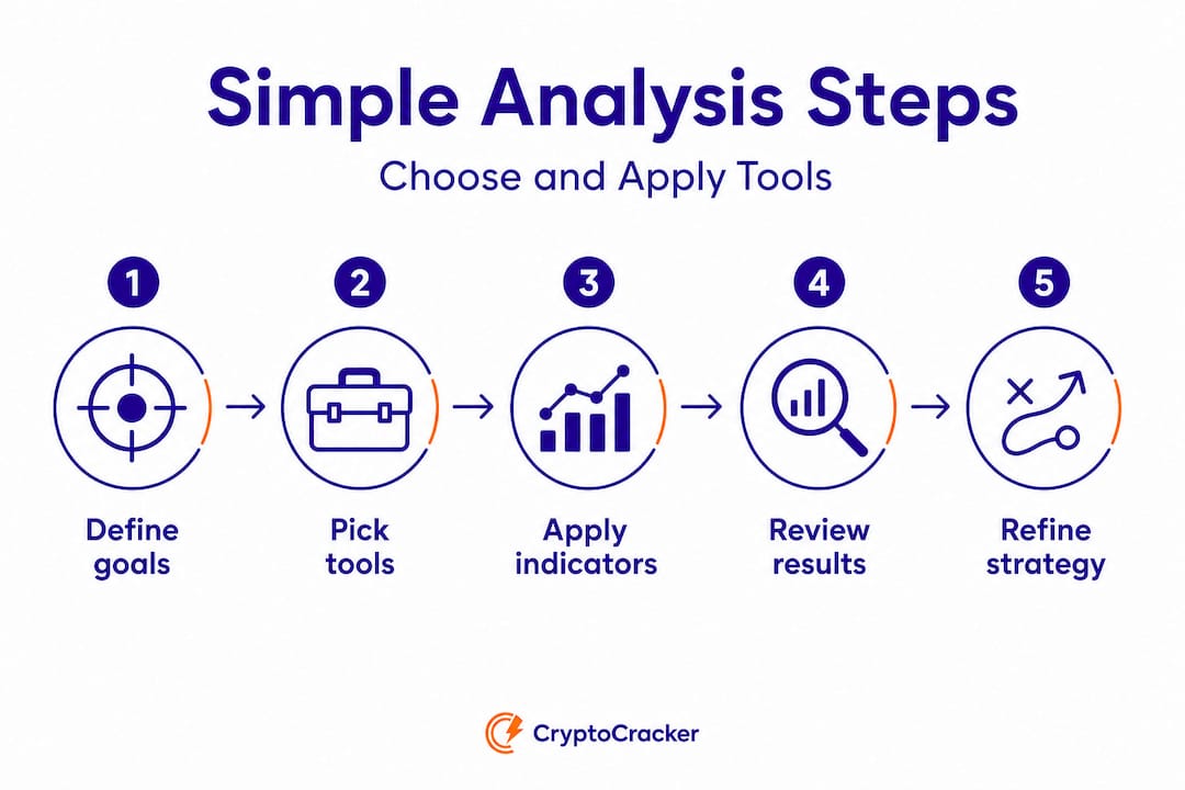
Start with your goals. Are you tracking an existing portfolio? Identifying new opportunities? Building an automated savings strategy? The answer shapes which features matter most for you.
Evaluate the onboarding experience. A genuinely user-friendly platform should be usable within minutes of signing up, not after hours of tutorials. If you need a certification to run a basic chart, that’s a red flag.
Look for these specific features:
- Guided dashboards that present data logically, without requiring manual configuration
- Integrated tracking portfolio performance tools that give you a complete picture in one view
- Template-driven analysis setups that apply sensible defaults automatically
- Built-in risk management cues, such as alerts when market conditions make certain signals less reliable
- Clear, accessible educational content embedded directly in the platform
Apply your tools consistently. Consistency matters more than sophistication. Using a simple, well-chosen set of indicators every session produces better results over time than constantly switching strategies. The power of market analysis comes from applying it regularly and building pattern recognition over time.
Review and adjust. Periodically assess whether your chosen indicators and workflows are still serving your goals. As top charting tools research confirms, the best platforms make this review process easy through built-in performance metrics and portfolio comparisons.
The right tool isn’t the one with the most features. It’s the one you’ll actually use consistently, understand clearly, and trust enough to inform real decisions.
Why most investors overcomplicate crypto analysis (and what actually works)
With best practices outlined, here’s our take on what really sets effective analysis apart, and how to avoid the classic pitfalls we see repeatedly.
We’ve seen a pattern emerge again and again: investors start with a simple setup, get a few wins, and then immediately start adding more indicators, more signals, more automation, convinced that complexity is the path to better returns. It almost never works out that way.
The honest truth is that overloading on signals and automation rarely increases profits. What it reliably does is increase confusion, emotional reactivity, and ultimately, costly mistakes. When your dashboard is a wall of numbers and competing alerts, you stop making decisions based on insight and start making them based on anxiety.
What actually works is something far simpler. Clean analysis paired with genuine education beats prediction-based approaches every time. When you understand why an indicator is showing you what it’s showing, rather than just reacting to whether it’s red or green, you make fundamentally better decisions. That understanding only comes from taking the time to learn the basics and apply them consistently.
There’s also a psychological dimension worth naming directly. As this community-sourced analysis confirms, cleaner and signal-first layouts reduce stress and improve comprehension. When you’re less stressed, you think more clearly. When you think more clearly, you trade more rationally. The design of your tools isn’t just a convenience issue. It’s a performance issue.
Our strong view is that investors should focus on workflows that organize decisions rather than chase certainty. Build a routine around two or three reliable indicators. Understand the market context before acting on any signal. And lean into platforms that reward consistent, structured thinking rather than impulsive reactions. When you build your approach around trend analysis wisdom, you’re building something durable. That’s the real edge.
Take the next step: User-friendly crypto analysis tools at CryptoCracker
If this guide has shifted how you think about crypto analysis, you’re already ahead of most investors. Now it’s time to put these principles to work with tools that are genuinely built around simplicity, clarity, and actionable insight.

CryptoCracker is designed from the ground up for investors who want data-driven decisions without the complexity overload. Our CryptoCracker analysis tool brings together market signals, performance metrics, and guided workflows in a single clean dashboard, so you spend less time configuring and more time deciding. Whether you’re focused on optimizing your portfolio or building a consistent tracking practice through our portfolio tracking strategies, CryptoCracker gives you the structure and clarity to invest with real confidence. Explore the platform today and see how accessible smart analysis can be.
Frequently asked questions
What makes a crypto analysis platform user-friendly?
User-friendly platforms organize charts, indicators, and portfolio data into intuitive dashboards and templates, reducing the need for technical setup. As charting tool research shows, the best platforms package core components so users can work immediately without deep configuration.
Can user-friendly analysis tools guarantee profitable trades?
No, user-friendly tools help organize decisions but cannot guarantee accuracy or profits due to market uncertainty. As beginner chart guides make clear, analysis frames probabilities and decisions, not certain outcomes.
Should I use every available signal or indicator?
It’s best to focus on a manageable set of structured indicators for clear decisions, as too many signals can overwhelm and confuse. Community analysis confirms that signals-only approaches degrade in choppy markets, making clarity more important than quantity.
What are the core features to look for in user-friendly crypto analysis?
Look for real-time charts, portfolio performance tracking, watchlists, and template-driven dashboards that make market data actionable. According to top charting tools research, these components are the foundation of any platform designed for practical, everyday use.