TL;DR:
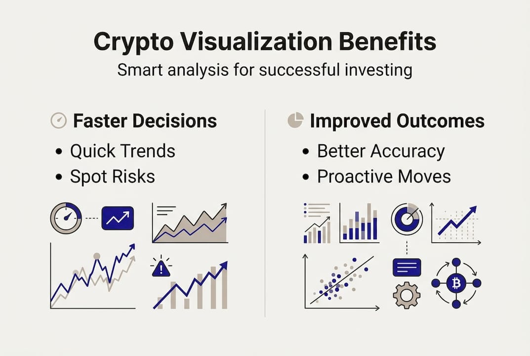
- Visualization helps investors quickly identify trends and risks, improving decision-making speed and accuracy.
- Different chart types like heatmaps and candlesticks are crucial for interpreting market signals effectively.
- Connecting multiple visual cues provides a better trading narrative, reducing impulsive errors and enhancing outcomes.
Most crypto investors believe that more data equals better decisions. Stare at enough price feeds, volume charts, and order books, and the right move will reveal itself. But that assumption is the very thing that trips people up. Visualization systems reduce task times and improve decision accuracy in ways that raw numbers simply cannot match. The real edge in crypto trading is not access to more data. It is the ability to see what that data is actually telling you. In this article, we explore why visualization is one of the most underrated tools in any investor’s toolkit and how to use it to your advantage.
Table of Contents
- Why raw numbers aren’t enough: The complexity of crypto trading data
- The power of visualization: Seeing the story behind the numbers
- Key benefits for portfolio management and strategy
- How to visualize: Tools, best practices, and what most people miss
- The overlooked edge: Why true insights come from connecting the dots
- Unlock your crypto edge with smarter visualization tools
- Frequently asked questions
Key Takeaways
| Point | Details |
|---|---|
| Transforms complexity | Visualization turns overwhelming crypto data into clear, actionable insights for your portfolio. |
| Boosts decision accuracy | Empirical research shows visual tools help you make faster, smarter trades with higher success rates. |
| Essential for all investors | Modern, user-friendly platforms make advanced visualization accessible to both beginners and pros. |
| Supports diversification | Visualization reveals correlations and outliers supporting better risk management and asset allocation. |
Why raw numbers aren’t enough: The complexity of crypto trading data
Crypto markets never sleep, and they never slow down. Every second, thousands of data points are generated across hundreds of assets: price movements, trading volume, social sentiment, on-chain activity, and macroeconomic signals. Trying to process all of that manually is not just inefficient. It is genuinely overwhelming.
Crypto markets are highly volatile and data-heavy, making manual analysis difficult even for experienced traders. When you add the emotional pressure of real money on the line, the cognitive load becomes even heavier. Most investors do not fail because they lack information. They fail because they cannot organize and interpret it fast enough to act.
Here are the most common mistakes that happen when investors rely solely on raw numbers:
- Analysis paralysis: Too many data points with no clear framework leads to inaction or delayed decisions.
- Missing outliers: Unusual price spikes or volume anomalies are easy to overlook in a spreadsheet but immediately visible in a chart.
- Inefficient tracking: Manually monitoring multiple assets across different exchanges creates gaps and blind spots.
- Confirmation bias: Without visual context, it is easy to focus on numbers that confirm what you already believe.
Volatility makes this worse. During a fast-moving market phase, the window for a smart decision can be minutes wide. A portfolio management framework that relies on spreadsheets and manual data pulls is simply not built for that speed. You need a better lens, and that is exactly what visualization provides.
“The human brain processes visual information up to 60,000 times faster than text. In a market that moves in seconds, that processing speed is not a luxury. It is a necessity.”
Good crypto market analysis starts with transforming raw data into a format your brain can actually use. That is the foundation everything else is built on.
The power of visualization: Seeing the story behind the numbers
Here is a number worth pausing on: image-based predictive models using visual trading data have reached 96% prediction accuracy in empirical studies. That is not a marginal improvement. That is a fundamental shift in how we approach market analysis.

The same research confirms that visualization systems reduce task completion times and improve accuracy for traders at every skill level. What used to take hours of manual review can be done in minutes when the data is presented visually. Patterns that are invisible in a column of numbers become obvious the moment they are rendered as a chart.
The table below illustrates how visualization changes the experience of working with trading data:
| Task | Without visualization | With visualization |
|---|---|---|
| Spotting a price trend | 15 to 30 minutes | Under 2 minutes |
| Identifying volume anomalies | Often missed | Immediately visible |
| Comparing asset correlations | Hours of manual work | Seconds with a heatmap |
| Tracking portfolio performance | Error-prone spreadsheets | Real-time dashboard |
The difference is not subtle. Visualization removes friction from the analysis process, which means you spend less time decoding data and more time making decisions.
Not all chart types are created equal, though. Crypto price prediction research shows that the type of visual you choose matters as much as using one at all. Candlestick charts are ideal for reading short-term price action. Heatmaps reveal sector-wide momentum at a glance. Correlation matrices show how your assets move in relation to each other, which is critical for managing risk.
Pro Tip: Match your chart type to the question you are trying to answer. If you want to understand momentum, use a candlestick chart. If you want to spot which assets are dragging your portfolio down, use a heatmap. Pairing the right visual with the right question is what separates good analysis from noise. Explore trading indicators to see which ones pair best with each chart type.
A good market analysis tool puts all of this at your fingertips without requiring a data science degree to operate.
Key benefits for portfolio management and strategy
Visualization does more than make data look cleaner. It actively changes how you manage risk, identify opportunities, and build a resilient portfolio. Visualization simplifies portfolio management by supporting trend identification, risk assessment, and diversification in ways that manual methods simply cannot replicate.
Here is what you gain immediately when you switch to visual portfolio management:
- Correlation analysis: See at a glance whether your assets are moving together, which signals dangerous concentration risk.
- Outlier detection: Unusual performance in one asset stands out visually, prompting faster investigation.
- Diversification check: A visual breakdown of your holdings makes it obvious if you are overexposed to a single sector or asset class.
- Trend spotting: Multi-timeframe charts let you see both short-term noise and long-term direction without switching tools.
- Risk-adjusted view: Dashboards that combine price, volume, and volatility data give you a complete picture of each position.
The comparison below shows how manual analysis stacks up against a visualization-driven approach:
| Outcome | Manual analysis | Visualization tools |
|---|---|---|
| Risk identification speed | Slow, reactive | Fast, proactive |
| Diversification awareness | Limited, error-prone | Clear and immediate |
| Trend detection accuracy | Moderate | High |
| Decision confidence | Lower | Significantly higher |
Multi-factor dashboards and heatmaps give you a proactive edge because they surface problems before they become losses. Instead of reacting to a bad trade after the fact, you can see the warning signs building in real time.
Using dedicated crypto management tools that integrate visualization directly into your workflow is one of the most practical upgrades any investor can make. And pairing that with a solid trend analysis guide helps you interpret what you are seeing with more confidence.
How to visualize: Tools, best practices, and what most people miss
Knowing that visualization works is one thing. Knowing how to set it up correctly is another. Here is a straightforward process to get started:
- Choose a platform that fits your skill level. Look for tools that offer real-time data, customizable dashboards, and multiple chart types without requiring coding knowledge.
- Connect your data sources. Link your exchange accounts or import your transaction history so your visuals reflect your actual portfolio, not a hypothetical one.
- Select the right chart types for your goals. Use candlestick charts for price action, heatmaps for sector overview, and correlation matrices for risk management.
- Interpret with context. A spike in volume means something different during a bull run than during a correction. Always read visuals alongside broader market conditions.
- Review and adjust regularly. Markets change, and so should your visual setup. Set a weekly review cadence to make sure your dashboards are still answering the right questions.
Heatmaps and multi-dimensional confluence are more robust than single-indicator analysis, and data quality and latency are critical factors that many investors overlook. A beautiful chart built on delayed or incomplete data is worse than no chart at all, because it creates false confidence.
Pro Tip: Avoid loading your dashboard with every indicator available. More visuals do not equal more clarity. Focus on three to five key metrics that directly relate to your strategy, and look for moments when multiple indicators agree. That convergence is where the real signal lives. Explore crypto heatmap essentials to understand how to read sector-wide momentum effectively.
User-friendly platforms democratize advanced visualization for individual investors, meaning you no longer need institutional-grade infrastructure to analyze your portfolio like a professional. The tools exist. The question is whether you are using them.
When you are analyzing crypto trends, the quality of your visual setup determines the quality of your conclusions.
The overlooked edge: Why true insights come from connecting the dots
We have seen a pattern across the research and in our own experience: even skilled traders trip up when they fall in love with a single favorite visual. Maybe it is a particular moving average setup, or a volume indicator they trust completely. The problem is not the tool itself. The problem is treating one signal as the whole story.
Multi-dimensional confluence outperforms single-indicator reliance in crypto trading, and the empirical evidence backs this up. The traders and systems that consistently outperform are the ones synthesizing multiple visual cues, not optimizing one.
“Don’t hunt for magic indicators. Look for narrative across multiple views. When price action, volume, sentiment, and on-chain data all tell the same story, that is when you act.”
This is the edge most people leave on the table. It is not about finding the perfect chart. It is about building a visual system where different data streams confirm or challenge each other. When your market analysis tool surfaces convergence across multiple factors, that is your signal. When they diverge, that is your warning to wait.
The investors who build this habit consistently make fewer impulsive decisions and catch more high-probability setups. It is not glamorous advice, but it works.
Unlock your crypto edge with smarter visualization tools
Everything we have covered in this article points to one practical conclusion: the right visual tools change the way you invest. They reduce noise, surface real signals, and give you the confidence to act when it matters most.

At CryptoCracker, we built our platform around exactly these principles. Our crypto market analysis tool gives you real-time visual dashboards that connect directly to your Coinbase account, so your data is always current and accurate. Whether you are checking portfolio performance, tracking trends, or assessing risk, everything is designed to be clear and actionable. You can also explore our portfolio optimization guide to see how visualization fits into a complete investment strategy, or browse Cryptomanager.co alternatives if you are looking for a platform that goes further.
Frequently asked questions
What is the main benefit of visualizing crypto trading data?
Visualization lets you quickly spot trends, risks, and opportunities that raw data alone hides, resulting in more confident and timely trading decisions. Visualization supports market overview, trend identification, and risk insights that are simply not accessible through numbers alone.
Which types of visualization are most helpful for crypto trading?
Heatmaps, candlestick charts, and correlation matrices are most widely used for understanding market dynamics and portfolio risk. Heatmaps and charts provide sector insights, outlier detection, and the kind of confluence signals that support smarter entries and exits.
Do visualization tools work for both beginners and experts?
Yes. Modern platforms are designed to help both new and advanced investors make smarter, faster decisions with intuitive tools. User-friendly tools democratize visualization for all investors, removing the technical barrier that once made advanced analysis exclusive to institutions.
Can visualization tools really improve trading results?
Studies show that using visual systems reduces mistakes and boosts speed and accuracy. Visualization systems improve speed and accuracy, with some image-based models reaching up to 96% predictive accuracy in controlled research settings.